As designers, we’ve all been there, we build a comp in Photoshop were incredibly happy with that we’ve spent a good amount of time color proofing only to save it as a JPG, open it in our browser and it looks dull and washed out. It gets even more complicated when you’re working with another designer and you’re both getting completely different colors and can’t agree on which is right.
The solution is frustratingly easy and will help you gain back countless hours of frustration and anguish. Not to mention, it’s also much easier and better than simply turning off any color management in Photoshop, crossing your fingers, and hoping for the best.
The Simple Solution
Photoshop comes with color settings for most anything need you could throw at it, so there’s no complicated color management settings you need to dial in and save. Using this quick guide, you’ll have your working space fixed in less than a minute. Here are the three steps you need to follow to get consistent colors across your programs.
Step 1
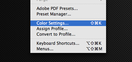
First we need to choose our color settings. Go to your menu bar and click on Edit -> Color Settings.
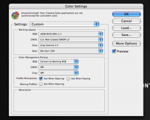
When this window comes up, you’ll be greeted with a slew of options. Don’t worry, most of them we won’t touch and the most important one is right up top. Under “Working Spaces” you’ll see a drop down-box for RGB profiles, select the sRGB IEC61966-2.1profile. Under “Color Management Policies” make sure the RGB drop -down saysConvert to Working RGB, then hit OK.
Step 2
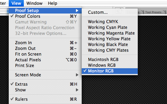
Now go to back to your menu bar and click on View, and select Monitor RGB. That will make sure Photoshop is displaying your work using the color profile we selected earlier. If you have a document you’re working on open, you’ll notice a slight color shift.
Step 3
Now click on View again in your menu bar and make sure Proof Colors has a check mark next to it. If not, click on it and you’re done!
There you have it! Just imagine, all your frustration was a few short clicks away from being solved. Of course, even with these color settings correctly implemented, there will inevitably be some inconsistencies across different devices, monitors and programs. Much of this you can’t help, but for the sake of having a working file that displays almost exactly what you’ll be seeing online, this fits our needs well.
I’ve created template files for starting my websites each with the sizes of the image, the guides in the right place for a variety of styles and sizes of websites, and my color settings all correct. I will post how I created my template files in another post soon, but in the meantime enjoy your correct colors!


