When the iPhone came out, Apple was crowned the king of mobile.
Oh, how the mighty have fallen.
Back in the early 2000’s designers were having an experimental free-for-all trying to figure out how a website should look and function.
Then in 2007 the iPhone was released introducing the world to the concept of apps. They were brand new and designers and engineers were figuring out how apps should look and function, then how to distribute them to users.
By now we’ve generally figured out the main UX rules of the internet. Apple has turned into a stubborn mule and dug it’s heels into the ground.
If you’re a multi-billion dollar technology company that makes 10–15% of your profits from the sale of apps, you would make it as easy as possible for users to download and buy apps.
At least you would think so.
Unfortunately, in some cases Apple has completely dropped the ball on this user experience.
Take the App Store experience for example.
Clearly it’s built for the phone, but your phone isn’t the only place you’re looking at an app. If you’re anything like me, you’re often looking online, especially if you’re looking at an app-based company’s website.
Apps Online
Let’s say you’re reading the Product Hunt Daily newsletter and stumble upon an interesting app. Let’s say that happened this morning and the app is Crypto Central. It’s got good reviews, and it sounds like its worth a peek.
You click to visit their website. It’s a modern-looking, call-to-action heavy site. So far so good, you know what you’re here for and the CTA is clear.

You think “Ok, I have an iPhone, let’s check out the app”. You click on the “Download on the App Store” button.
That’s where things start to go wrong.
Now you’re on the online App Store site. Take a look at this screen and see if you can tell what the next step is.
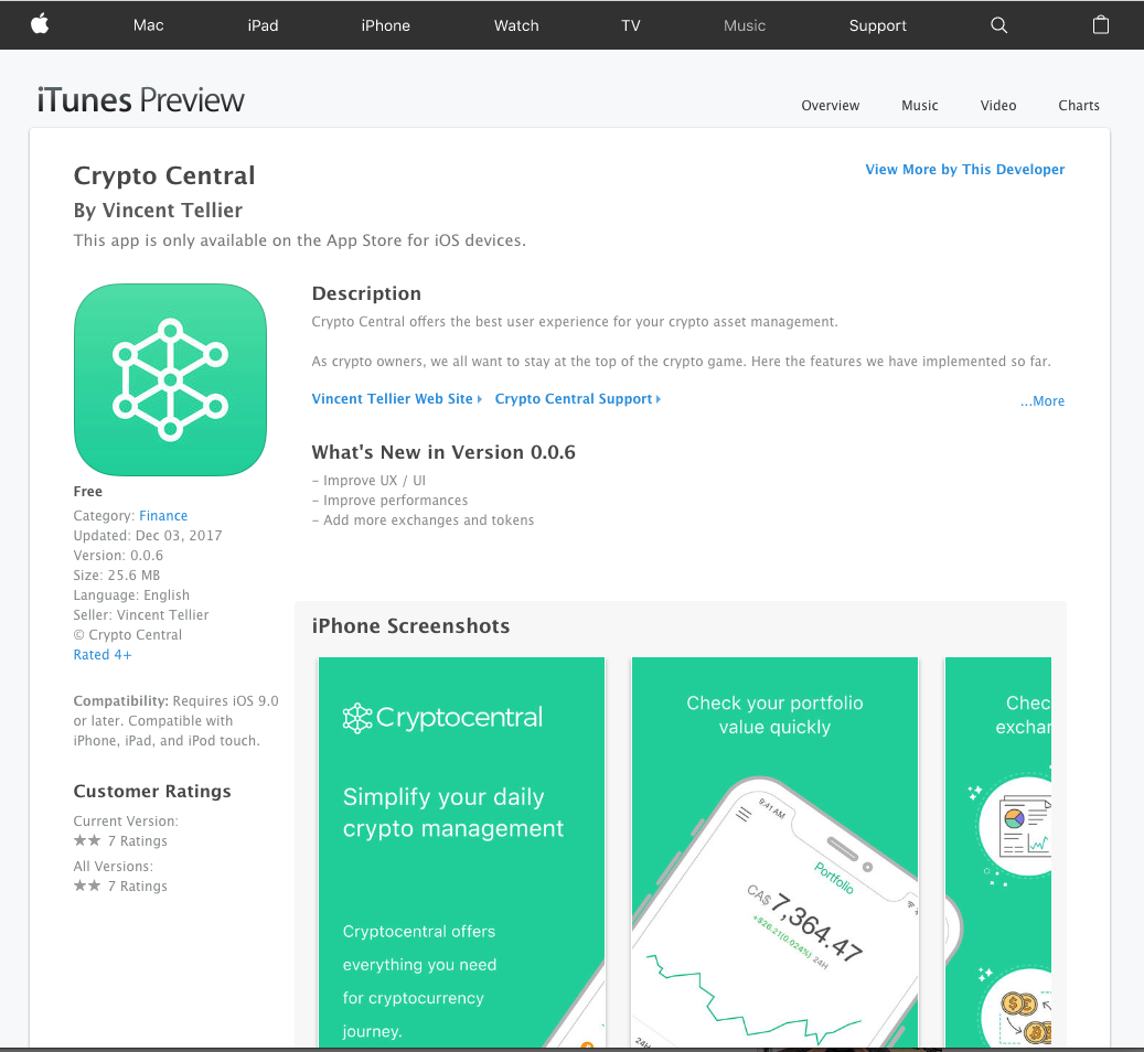
Is it “View More By This Developer”? No. I want to view THIS app.
Is it the “Vincent Tellier Web Site”? Wrong again, that doesn’t get me this app.
Is it “Category: Finance”? Good bit of info, but nope.
Then (if you’re anything like me) after a few minutes, you notice this buried line:

Here’s the problem: I know it’s an iPhone app, that’s why I came here. That copy doesn’t help me at all.
That little buried bit of copy tells me I have to take another step.
An unnecessary one.
Grab Your Phone
During the day, I’m working which involves staring at my computer for 8+ hours. My phone is a distraction (looking at you, Facebook, Instagram, Twitter), so I try to keep it handy for phone calls, but dark.
That means when I come across an app I want, the easiest thing for me to do is click a button on my computer and have it download to my phone. 1–2 clicks, and done.
Apple doesn’t agree apparently.
Since there there’s no “Install” button, I have no choice but to try something else.
The next logical step in my mind is to use the App Store. After all, that’s what that little buried bit of copy says, right?
Let’s be honest, the App Store is the store for apps, which both my computer and my phone use, so that should work.
I pull it up, search for the app and…
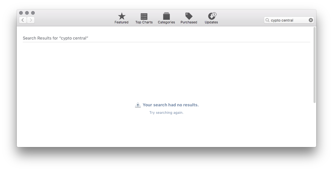
As you can guess, no dice. It doesn’t dawn on me until after I was finished with this ultimately fruitless exercise that the App Store on my computer is for computer apps and ONLY computer apps.
Rereading that little buried bit of copy, it’s obvious they were trying to let me know, albeit not very clearly.
Maybe iTunes?
Then I remembered, this used to work in iTunes!
I open iTunes and try it there.
(I had to sign-in to my Apple ID twice in iTunes. Unrelated, but still frustrating)

Shocking to no one by now, iTunes had nothing useful for me. The app in question is neither a song nor a podcast, and at this point that’s all iTunes offers.
I had forgotten hearing years ago that Apple had removed app management from iTunes. To be completely honest, I haven’t opened iTunes since I switched to Pandora and then Spotify. Even for podcasts I use the Casts app.
Sometimes I’ll hit the play button on my keyboard, and the ever hopeful iTunes pops up long enough for me to curse it and push it back down every time.
That’s a topic for another day…
Fine, I’ll open up my phone
At this point, I give up. This app had better be worth it to go through this frustration. I open it up on my phone, which involves several steps in and of itself: unlock phone, swipe down to bring up search, type in “App store”, tap the App Store icon, tap the search icon, type the name of the app, look up halfway through typing the app name to make sure you’re typing it correctly…
Finally, I have the app in my sights.
Voila, that was simple. /s
Note to self: Dude, next time you see an app you like, save yourself the frustration. Just pick up your phone and go through several more steps than you otherwise should/would.
The User Path
If you were counting, from the company’s website to getting the app, that amounts to a total of at least 9 steps to finally download the app.
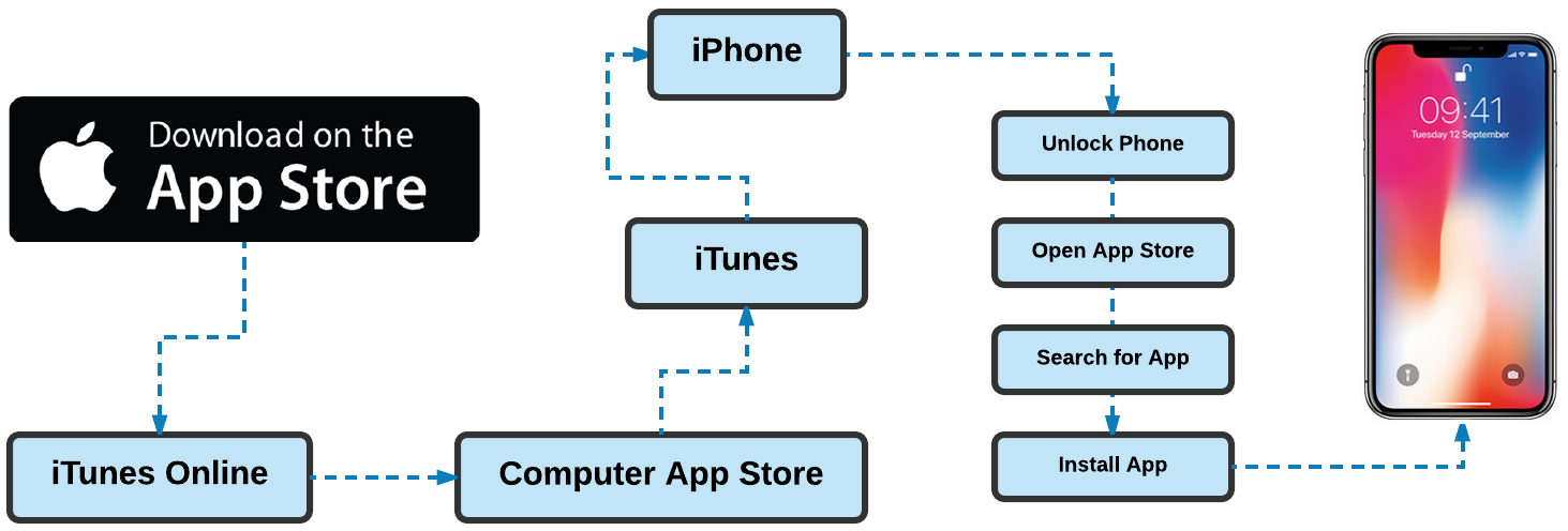
9 steps? For an app I’m not even sure I’ll like?!
Ok ok, I know I had a couple of missteps that I probably wouldn’t take every time.
But take out those missteps and you still end up with a total of 7 steps just to download one app.
“But that’s only a couple of seconds, stop being lazy” -Everyone to me
Ok, I get it. It’s a minor inconvenience, but I like my instant gratification!
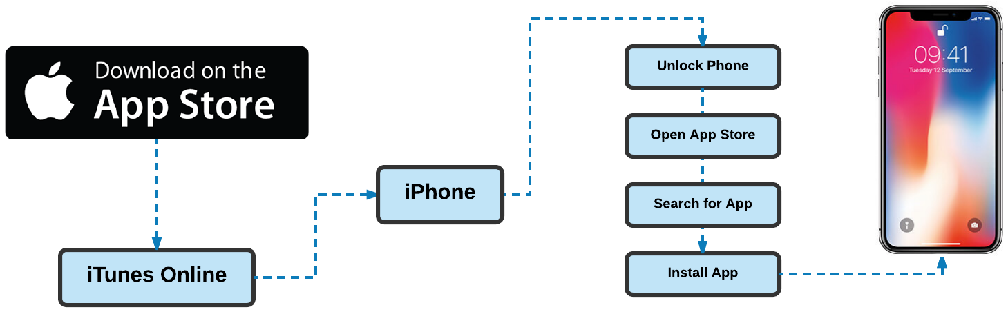
Actually, I take it back. It’s the principle of matter. It should be easy and it’s not. Like I said before, this isn’t 2007. We’ve figured out how to do this, we don’t need to reinvent anything.
Here’s how the Apple process should look (but doesn’t):
The Solution
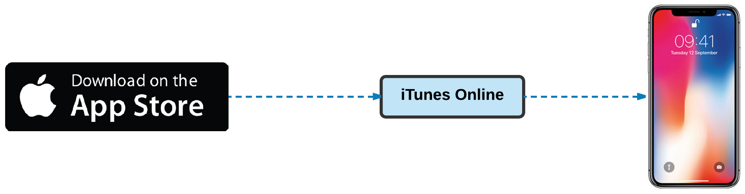
Apple doesn’t have to reinvent the wheel, or come up with some “revolutionary” new experience here. They can just take a page from Google’s book.
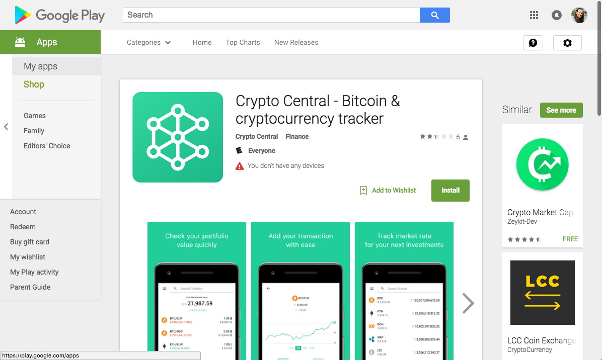
See that beautiful, simple, little “Install” button?
If you have an Android, it’s dead easy. You click that button, and it downloads onto your phone and installs itself. Simple.
From a company’s website, that is 3 steps at the very most.
Apple could replicate this easily, so why haven’t they?
I don’t work at Apple and I don’t have the answer. If I had to guess, it would have something to do with more important priorities.
After all, Apple has bigger fish to fry.
The fact remains: This sort of experience is an example of the very thing eroding the thin veneer of Apple’s UX dominance. Companies like Google (who have their own fair share of criticisms) are eating their lunch.
What do you think? What issues with Apple’s ecosystem have plagued you?
Originally published on Medium.